Religion & Art Live4 May: Linda Mary Montano, Evensong with video, voice and organ, Holy Trinity, Prince Consort Rd
8 June: [TBC]
6 July: St Pancras Church
Host at St Saviour’s, PimlicoAn annual series of exhibitions by Chelsea MA Fine Art students alongside artists from the church
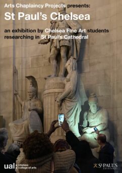
St Paul’s ChelseaChelsea BA Fine Art students researching contested legacies in St Paul’s Cathedral
Religion & Art Talkswith José Carlos Diaz, Adrian Rifkin, Tina Beattie, Jarel Robinson-Brown
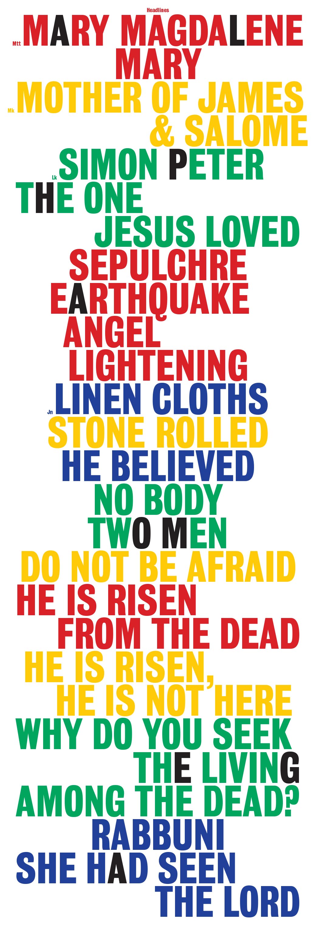
Three QuestionsIf I am not for myself, who will be for me? If I am only for myself, what am I? If not now, when?
Religion & Art Forum30 practice-led conversations, held in collaboration with Goldsmiths College
Stations 2021An art project for Lent, leading to an online exhibition for Easter, with 36 artists showing 140 works

The Spiritual Exercises 2a project building on connections made during The Spiritual Exercises, with 72 artists working in 24 collaborations
The Spiritual ExercisesAn online exhibition mediating memory and longing via the parameters of the present, featuring 100 artists
Palo SantoA project exploring the potential of craft-based practices for communal healing, working between London and Peru
Pastiche MassA penitential mass with five video and sound works replacing the choral parts
Heathrow Chapel LightboxesA collaborative exhibition to celebrate the 50th anniversary of St George’s Interdenominational Chapel at Heathrow Airport
Central Saint Martins in the FieldsAn exhibition of work by ten recent art and design graduates from Central Saint Martins in the Crypt of St Martin-in-the-Fields, reconnecting the college and the church that founded it
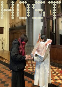
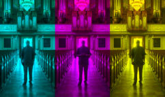
Stations of the CrossAn Easter vigil with 14 video works projected onto the Henry Moore altar in St Stephen Walbrook Church, interspersed with readings and silence, culminating in a dawn Eucharist
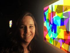
My DevotionA series of talks across UAL focusing on the relation between creative and spiritual practices, with Faisal Abdu’Allah, Bonnie Camplin, Lucy Newman Cleeve, Sophie Gorton, Sarah Lightman, and Justin Senryū Williams